Why Webflow Forms Fail Accessibility & How I Fixed Mine

Let’s be real: most websites exist to get people to take action—whether that’s to make a purchase, request a quote, sign up for a service, or join a newsletter. And all of those actions have one thing in common: they end in a form.
Forms are conversion tools.
Forms are communication bridges.
Forms are the final step in your user's journey.
So why are they so often neglected?
Most designers focus on visual polish. Most developers focus on functionality. But form usability—especially for people with disabilities—falls through the cracks. And it's costing you conversions, users, and trust.
Even users without disabilities find forms confusing, overwhelming, or frustrating. Now imagine navigating those same forms with a screen reader, or relying solely on a keyboard, or having ADHD and facing 12 ungrouped radio buttons with no explanation.
We’re not talking about edge cases. We’re talking about millions of people who are being left behind by poorly built forms.
The common denominator? Forms are hard.
And accessible forms are even harder—but they are non-negotiable.
Short answer: No.
Webflow’s built-in form system relies entirely on HTML5 default validation. That means your forms are getting all their error handling, field format requirements, and focus behavior from the browser—not from carefully structured, semantic, or inclusive code.
HTML5 form validation can feel magical to newer developers—it adds required fields, gives you instant warnings, and prevents submissions when data is invalid.
But under the surface, it has significant limitations when it comes to accessibility and WCAG conformance:

Validation messages are not programmatically tied to the input field in error. That means:
aria-describedby to link errors and inputsThis breaks key WCAG criteria around 1.3.1 Info and Relationships, and leaves screen reader users guessing.
HTML5 validation messages are temporary and transient. They disappear as soon as the user interacts with the form again, even if the error isn’t fixed. This:
For inputs like email, phone number, or date, the browser checks for format behind the scenes—but rarely explains what the expected format is. Users are left to guess why their input was rejected.
This is especially problematic for neurodivergent users, users with cognitive disabilities, and anyone who doesn’t follow rigid formatting conventions without explicit instruction.
Want to add an error icon or animation for visual users? Want to include helpful hints in red text or place messages above the field? Too bad.

HTML5 validation treats each checkbox or radio input independently, with no understanding of grouped questions. This means:
<fieldset> and <legend> meaningfullyOn mobile devices and smaller screens, validation messages often obscure other inputs or content on the page, which leads to frustration and prevents users from correcting their inputs easily.
This part confuses many developers, so let’s clarify:
A form is accessible when it is usable by real people equally. That means:
A form is WCAG conformant when it passes the success criteria in the Web Content Accessibility Guidelines (WCAG). This includes:
👉 You can have a form that technically passes WCAG but is still frustrating to use. Conformance is the baseline—usability is the goal.
I’ve spent years wrestling with form validation inside Webflow—auditing and building forms for banks, nonprofits, and service-based businesses. I've seen it all and here’s what I’ve learned:

For the past few years, I’ve been disabling Submit buttons on Webflow forms as a way to control client-side validation. It felt like a necessary workaround—especially given the platform’s limitations around native error handling.
I read Adrian Roselli’s article last year (2024). I agreed with everything he said. But I didn’t have a better solution—so I kept doing what I was doing: disabling the button, adding a few inline messages, and hoping that was “good enough.”
More recently, I started digging into Adam Silver’s blog. His writing really caught my attention. His approach is focused, thoughtful, and deeply practical. I’ve learned so much just from reading.
I even asked Adam to review one of my forms. And—no surprise—he was not a fan of the disabled submit button. I gave him the same answer I’ve told myself for years:
“Well, this is the best I can do in Webflow.”
But here’s the truth: that wasn’t an honest answer.
I could do better—and now, I am doing better.
Thanks to what I’ve learned (and finally accepted), I am now building forms that no longer rely on disabled buttons. Instead, they offer:
It took time to admit that what I was doing wasn’t working. But this shift has been freeing—and far more aligned with my commitment to accessibility and user-centered design.
I’m grateful for the honesty of experts like Adam Silver and Adrian Roselli. They challenged me to rethink my approach—and pushed me toward building a solution that actually works for everyone.
After years of workarounds, I’ve finally implemented a custom form validation solution tailored for Webflow—one that checks all the boxes for usability, accessibility, and WCAG conformance.
This is the Graceful Web Forms solution, and it’s now live on my own website:
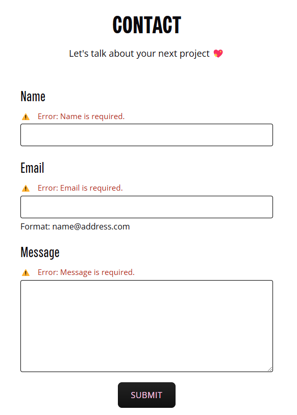
Both forms use accessible inline error messaging, proper field associations, keyboard-friendly interaction, and support for checkbox and radio groups—all built with real users in mind. I even fixed the non-existent Webflow <fieldset> and <legend> issue with another bit of scripting!
This solution is now going to be rolled out to all of my current clients. They’ll be the first to have Graceful Web Forms implemented across their websites if they choose to upgrade.
Next, I’m exploring how to share this with the wider Webflow community. I’m currently evaluating:
Accessible forms aren’t just a feature—they’re a responsibility. And now that I’ve built something better, I’m committed to bringing it to more teams, businesses, and creators.
Let’s make inclusive form design the standard.
Let’s build forms that work—for everyone.
Let’s Bloom with Grace.
Send a message or request a project quote for an estimate within 24 hours. Prefer to chat? Book a call, and let’s find the right solution for you!