How to make Relume Modal Slide-In Component Accessible

Developers, if you love Relume as much as I do, you already know it's the secret sauce that speeds up Webflow projects and makes them look stunning. I am a huge fan of the Relume library and have been a loyal customer for almost two years. Relume integrates perfectly into my workflow (even if I do spend a bit of extra time cleaning up those quirky naming class number conventions home-header37-OMG_Content 😜). But here's the kicker: while Relume speeds up my dev time, inspires my creativity and boosts my productivity, its out-of-the-box components rarely meet the accessibility standards I insist on.
As an Accessibility-First Webflow agency, I can’t ship anything that isn’t fully accessible, so I roll up my sleeves and script the fixes myself. I’m here to share how I transformed the Relume modal slide-in component into a WCAG 2.2 AA compliant dialog—because I’m sure there are plenty of fellow developers out there who care about accessibility and need a little guidance on making their components as inclusive as they are innovative.

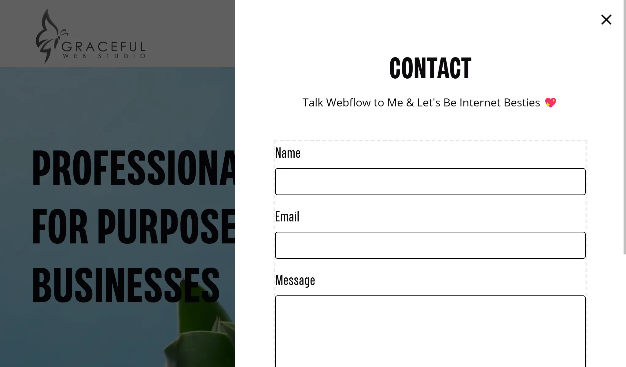
Relume UI Element Modal 2 was my base component ( I add my own accessible form - that will be explained in a future "How-to Create Accessible Forms in Webflow" blog post)
P.S. Developers if you are not already subscribed to Relume - please subscribe now or this tutorial will not work for you. 😉
The default Relume modal component looked great and worked smoothly. However, it wasn’t accessible by default. Key issues included:
aria-labelledby attribute to the modal wrapper—using the heading’s ID—set the role to dialog, marked it as aria-modal="true", and included tabindex="-1". These changes, made via Webflow’s custom attributes, ensure screen readers announce the dialog with a clear, descriptive name.button and an aria-label="Close", I ensured that the close button is clearly identifiable and functions correctly for keyboard users.contact-modal-trigger). Although it was originally a link, I assigned it the role of button since its purpose is to open a dialog.aria-haspopup="dialog" attribute to signal that this button controls a dialog popup—providing essential context for assistive technologies.Since Webflow handles the dialog’s visibility through its interactions, my custom jQuery script focused solely on managing focus—addressing the issue where focus was not sent to the dialog and was left on elements behind it:
Below is the complete code snippet that brings these enhancements to life:
<!-- jQuery CDN -->
<script defer src="https://code.jquery.com/jquery-3.7.1.min.js"></script>
<script defer>
$(document).ready(function() {
  // Function to trap focus within the modal
  function trapFocus(modal) {
    var focusableElements = modal.find('a[href], area[href], input:not([disabled]), select:not([disabled]), textarea:not([disabled]), button:not([disabled]), [tabindex]:not([tabindex="-1"])');
    var firstFocusable = focusableElements.first();
    var lastFocusable = focusableElements.last();

    // Listen for Tab/Shift+Tab keydown events on the modal
    modal.on('keydown.trap', function(e) {
      if (e.key === 'Tab' || e.keyCode === 9) {
        if (e.shiftKey) {
          // If Shift+Tab pressed on first element, move focus to the last element
          if ($(document.activeElement).is(firstFocusable)) {
            e.preventDefault();
            lastFocusable.focus();
          }
        } else {
          // If Tab pressed on last element, move focus to the first element
          if ($(document.activeElement).is(lastFocusable)) {
            e.preventDefault();
            firstFocusable.focus();
          }
        }
      }
    });
  }

  // Function to remove the focus trap event listener from the modal
  function removeTrapFocus(modal) {
    modal.off('keydown.trap');
  }

  // Listen for click or key press on the trigger button
  $('#contact-modal-trigger').on('click keydown', function(e) {
    // Delay to allow Webflow's interaction to open the modal
    setTimeout(function() {
      var modal = $('#contact-modal');
      if (modal.is(':visible')) {
        modal.focus(); // Explicitly send focus to the modal
        trapFocus(modal); // Activate focus trapping
      }
    }, 100); // Adjust delay if needed
  });

  // Listen for click or key press on the close button
  $('.modal_close-button').on('click keydown', function(e) {
    // For keydown events, only act on Enter or Space keys
    if (e.type === 'keydown' && !(e.key === 'Enter' || e.key === ' ')) {
      return;
    }
    var modal = $('#contact-modal');
    removeTrapFocus(modal); // Remove the focus trap
    // Delay before returning focus to the trigger button
    setTimeout(function() {
      $('#contact-modal-trigger').focus();
    }, 100);
  });
});
</script>Q: Are Relume components accessible out of the box?
A: Not always. While Relume components are beautifully designed and highly functional, many of them—including modals—lack critical accessibility features like ARIA roles, focus management, and keyboard navigation. If you care about WCAG conformance, you’ll need to customize them.
Q: How do I make a Relume modal WCAG 2.2 AA compliant?
A: Start by giving the modal an accessible name using aria-labelledby, set the role to dialog, and apply aria-modal="true". Add tabindex="-1" to make the container focusable. Then, use JavaScript to trap focus inside the modal and return focus to the trigger when it closes.
Q: Do I need to use JavaScript to manage modal focus?
A: Yes. Webflow’s native interactions can open and close modals visually, but they don’t handle focus. You’ll need to write or borrow a script to trap focus inside the modal while it's open and restore focus to the trigger afterward. This ensures the dialog is keyboard navigable and accessible to screen reader users.
Q: What are the required ARIA attributes for an accessible modal?
A: At a minimum:
role="dialog" aria-modal="true"aria-labelledby="id-of-heading"accessible name "Close"tabindex="-1" on the dialog containerQ: How can I test if my modal dialog is accessible?
A: Great question! Here’s a quick testing checklist:
You can also test with screen readers like:
By adding unique IDs, proper ARIA attributes, and a robust focus management script, I transformed the Relume modal slide-in component into an accessible, WCAG 2.2 AA compliant dialog. Fixing the focus issues—ensuring focus is sent directly to the dialog and trapped within it—has not only made my projects more inclusive but also significantly improved the overall user experience.
I understand that accessibility isn’t easy—it takes time, practice, and commitment. I could have had this dialog added to my website, styled and published in under 30 minutes. Instead, I did it the right way, which took over an hour. Then I decided to take another hour to write this blog post and share my process because accessibility matters and so do the people I am developing for. By adding unique IDs, proper ARIA attributes, and a robust focus management script, I transformed the Relume modal slide-in component into an accessible, WCAG 2.2 AA compliant dialog. Fixing the focus issues—ensuring focus is sent directly to the dialog and trapped within it—not only made my projects more inclusive but also significantly improved the overall user experience.
If you’re a Webflow designer who cares about accessibility, I hope this guide inspires you to take the extra time to do things right. 🤩 Happy coding and accessible designing!
We build accessible, conversion-focused Webflow websites for businesses across Yakima and the US. Crystal Scott is a Certified Professional in Web Accessibility (CPWA) with 11+ years of front-end experience.
Our services:
Transparent pricing on every service page. Request a quote and get a response within one business day.
We would love to meet with you face-to-face. Whether virtually or for a coffee. Book a call, and let’s find the right solution for you! We review your site, map goals, and then deliver a clear plan and quote.